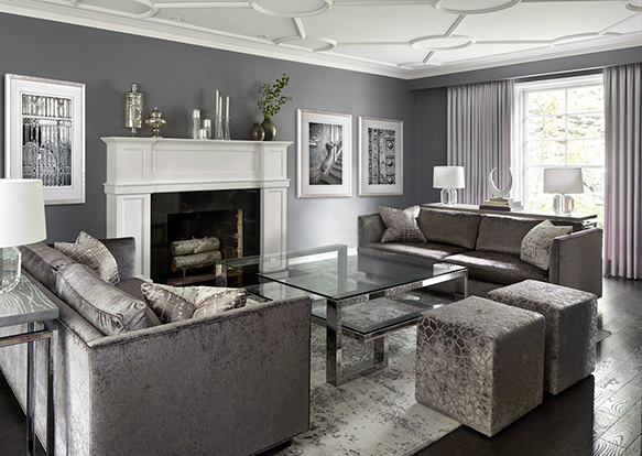
LIVING ROOM DESIGNED BY DFCL
I met with this homeowner for the first time when construction on their home had already been completed. The kitchen and powder room were newly renovated, the flooring installed, and the paint colours cured to the walls. The contractor had referred us to the job because the homeowner was ready to source furniture and lighting but needed help making things work together with the construction elements.
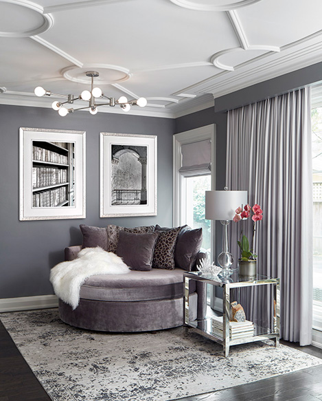
READING NOOK DESIGNED BY DFCL
Although it is always best to start working with a designer before construction begins, I have started many projects at this point in the design process. It actually makes things easier for me because the homeowner is very clear on how much money they have left for the rest of the project; there are no longer any changes to the room dimensions; and when flooring and paint colours have been pre-selected then we know what our starting colour palette will be.
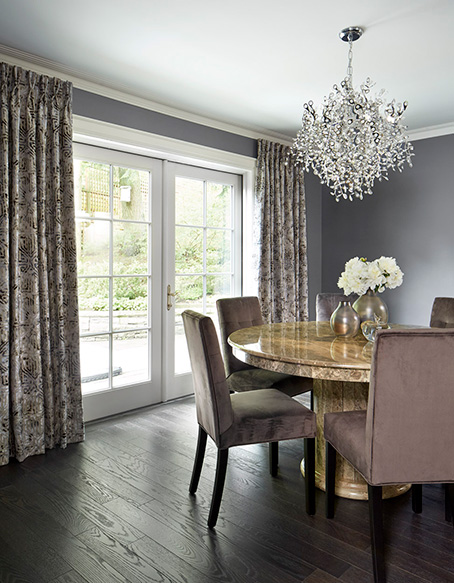
DINING ROOM DESIGNED BY DFCL
This approach however is less beneficial to the homeowner, as a completed renovation creates limitations on the final furniture and finish choices and can drive up costs when those limitations are unsatisfactory. Case in point…

FAMILY ROOM DESIGNED BY DFCL
The key paint colour selected for the living and dining room of this home was a beautiful mid-saturation gray with purple undertones from Benjamin Moore called Dior Gray. The homeowner loved it and gravitated towards every shade, tone, and tint of purple-gray that we came across in fabrics and materials. However, the way this paint colour affected the appearance of other colours was quite astonishing.
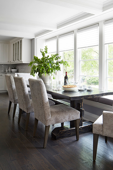
KITCHEN DINING DESIGNED BY DFCL
When we were sourcing materials, those materials would look a certain way in the vendor showroom; but when the homeowner took them home and looked at the same material in the living room, the Dior Gray paint changed the look of the material in ways that you would not expect. It proved to be quite challenging to pull together a complimenting range of purple-grey finishes that gave the room the necessary layers of textural and visual interest.
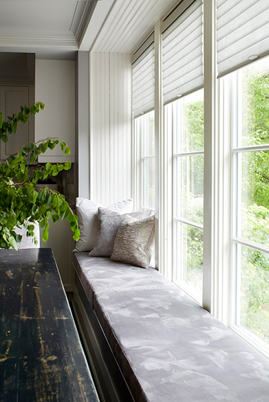
WINDOW BENCH DESIGNED BY DFCL
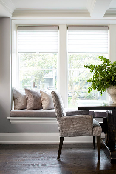
CUSTOM SEATING DESIGNED BY DFCL
What we ended up having to do is source a larger than normal range of materials to find the ones that did work well in the space with the Dior Gray paint colour; and all the furniture ended up being custom made. Thankfully the homeowner had the budget to accommodate this approach and we were able to create a gorgeous, finished design.
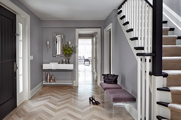
FRONT ENTRY DESIGNED BY DFCL
I always like to encourage homeowners to pick their paint colours towards the end of the design work, rather than the beginning. The logic behind this is that there are ten thousand paint colours to chose from, and often a lot less option in finishes and fabrics. You can certainly aim for a colour direction at the start of your project, and then look for that colour in your fabrics and materials first. Once the fabrics and materials are selected then you narrow in on the perfect complimenting paint colour for the walls.
Looking for someone to guide you in making smart and efficient choices throughout your renovation project. Design for Conscious Living® would love to help you and we have the design process in place to do just that.


